


Brand and Identity Design (Concept)
Space Systems Command (SSC), Los Angeles Space Force Base, California
Space Starts HERE
The Space Systems Command (formerly Space and Missile Systems Center) is a field command under the newly established United States Space Force (USSF) and the premier acquisition center for military space systems to include satellites, ground systems, and launch vehicles. Its vision is to forge an agile organization that delivers innovative, war-winning capabilities.
This brand and identity design CONCEPT is visualization of design standards for the organization. SSC has a long history of success dating to its inception as the Western Development Division in 1954. That success and excellence continue to this day, and for SSC to visually project itself as and innovative, trusted and respected organization and premier workplace for the best and the brightest, its visual design must reflect its values as an organization of excellence vital to the success of the nation and the future of space operations. This conceptualization of their brand builds on a standardized and sustainable branding built on creativity, innovation, and agility.
The SSC Brand Attributes
Mission-Driven
Innovative
Agile

LOGO: The Face of SSC

SSC’s emblem is designed around the brand attributes Mission-driven, Innovative, and Agile. SSC has a rich history of excellence dating to its birth as the Western Development Division under General Bernard Schriever in 1954, to its successful time as the premier space systems organization in the world as Space and Missile Systems Center, to its move towards the future as Space Systems Command under the United States Space Force. The emblem represents that heritage and the forward-looking innovative organization.
At the top of the emblem is the gold Polaris which represents the light of the guiding path towards success of SSC’s missions. The blue curved half ellipse embodies SSC’s global mission. This element also represents an abstract form of a light bulb which is recognized as a symbol of ideas and in turn represents SSC’s innovative attribute. The gold color and the delta launch illustrates SSC’s mission-driven and agile values that enables the organization to rapidly develop, acquire, field, and sustain the United States military space assets.
The SSC’s minimalistic emblem is designed to be an iconic and timeless symbol of excellence with a strong mnemonic value and recognizability. In a fast changing, technology-driven world, the emblem is responsive; while missions, warfare, and the environment may change, the design is readily able to adopt to changes. The SSC emblem isn’t a “description” of what it does, but rather it is the symbol that “identifies” SSC as an organization that will lead the way towards the future of space.
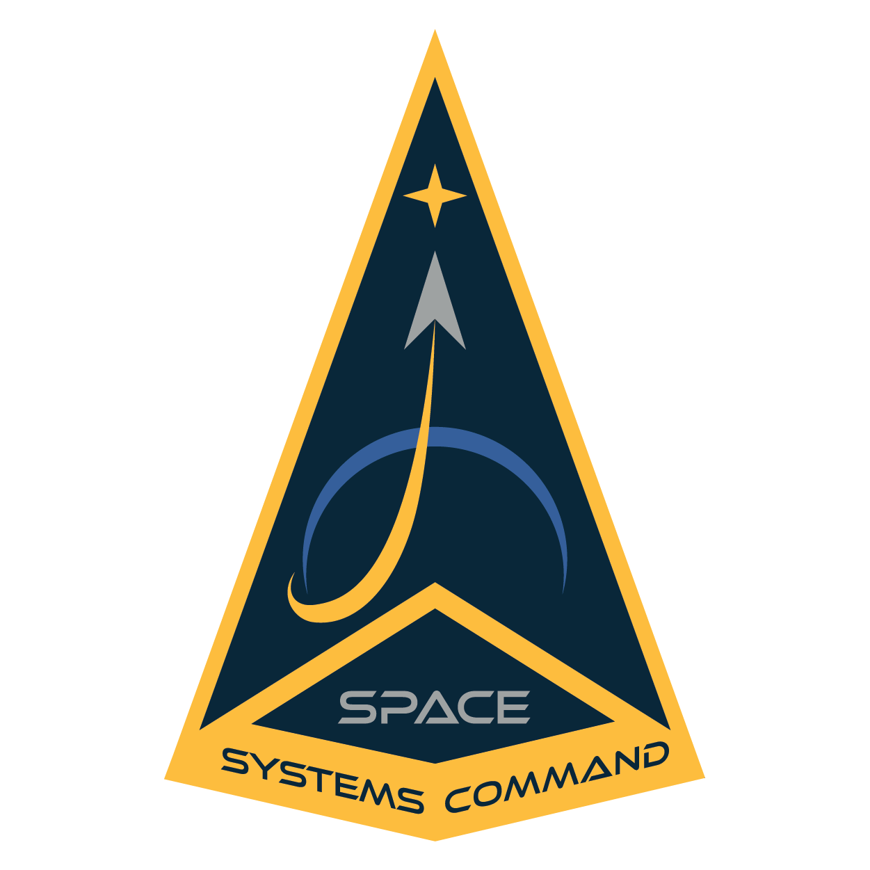
Full Command Emblem
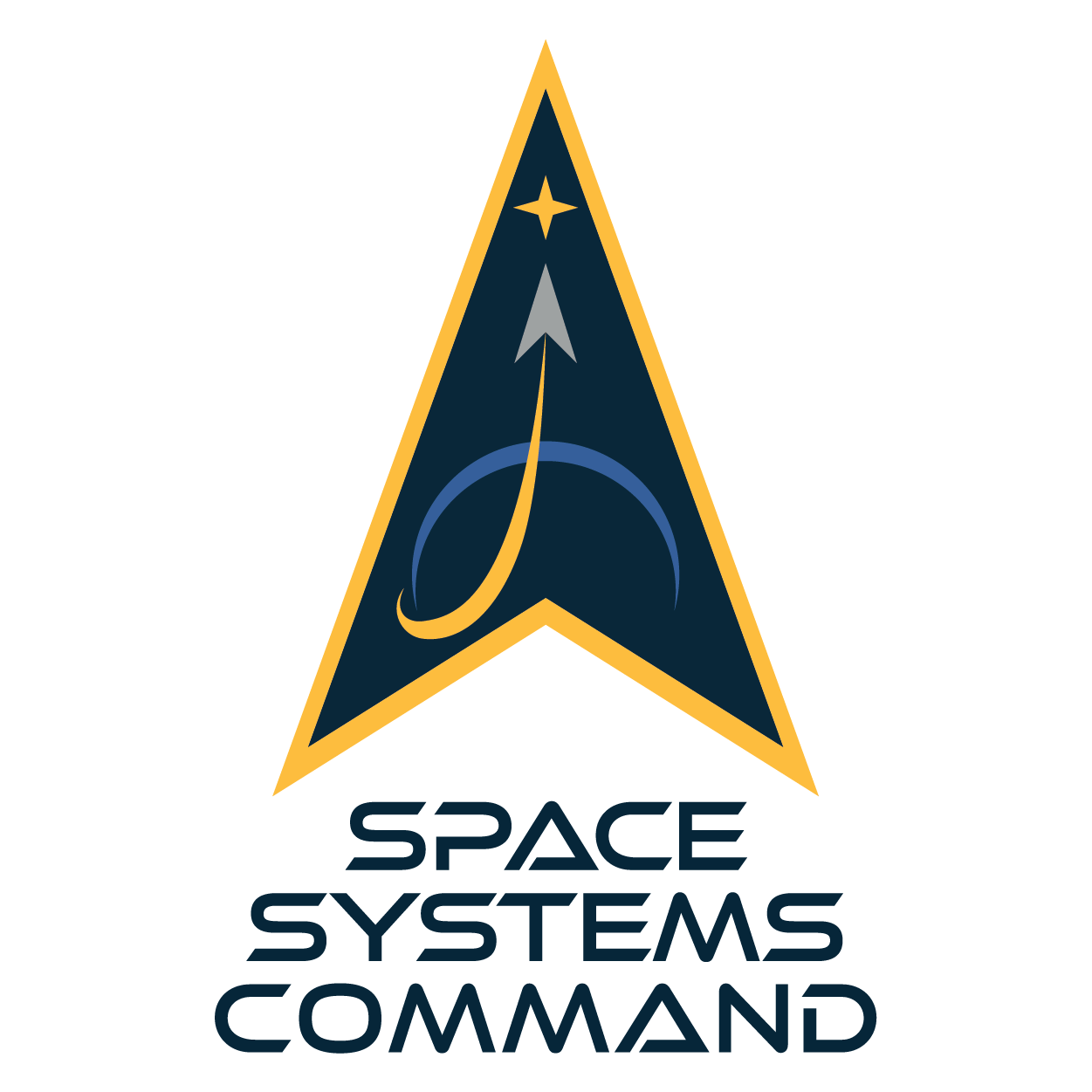
Logo

Secondary Logo
Wordmark
The COLORS of SSC
The blue and silver colors of SSC’s palette is the representation of the domain of SSC’s mission in delivering space capabilities; the gold is associated with agility and speed representing SSC’s ability to rapidly develop, acquire, and sustain space assets.

The Typography of SSC
Ethnocentric Light
SWIS721
SWIS911
Georgia
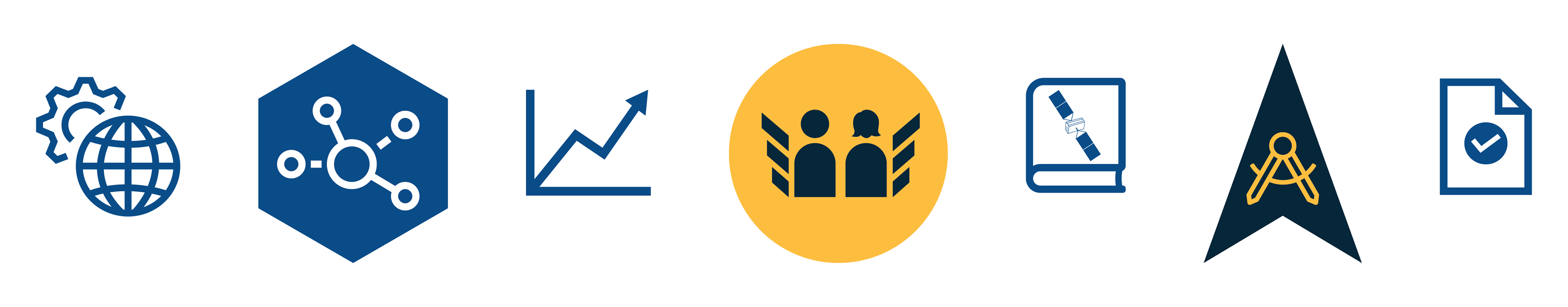
The Iconography of SSC
The images of SSC
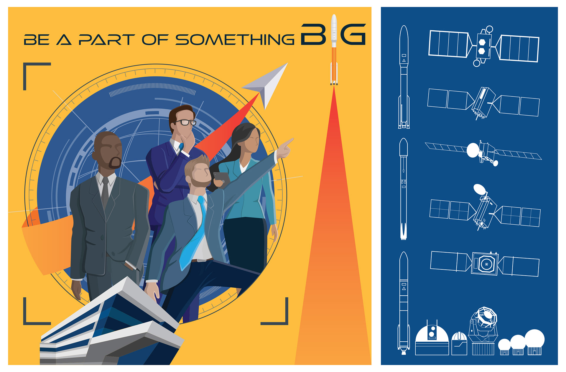
The use of images is a very powerful way to communicate and convey a clear message. As the saying goes, “a picture is worth a thousand words.” Images can provide profound experience that is symbolic and emotional. SSC’s brand use images such as photographs, illustrations, and graphics to help communicate its message as well as visualize its mission and values, and the innovative people leading the way.


Illustrations creates a visual way to portray words, thoughts, and ideas in a singular form. Illustrations integrated into graphic design is a current design trend employed by the biggest brands in the world. That is not to SSC is hopping on the bandwagon. By developing an illustration style unique to the brand, SSC can help distinguish itself in an even more creative and expressive way than tradition. Illustrations in a lot ways are more expressive and effective in creating an emotional connection that is not intimidating and far more humanistic than graphic design can provide. Illustrations can offer opportunities to take a brand to the next level of innovation and creativity.
SSC’s brand consist of two types of illustration: Full Color Illustration and Line Illustration and may be combined with one another.
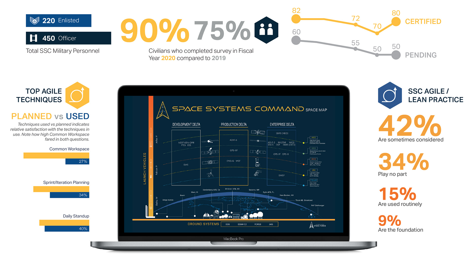
Data Visualizations & Infographics
Data visualization is storytelling with data and changing the way we inform and present, and putting an end to death-by-PowerPoint that has killed morale for many years. Data visualizations, and infographics are areas in visual design SSC will stand out and innovate. It is design meets art meets data science, a medium we can effectively implement storytelling with data. Storytelling with data is an area of weakness that we need to improve. With the use of illustrations, graphics, and infographics, data visualization will change the way we use and consume data to tell a story and narrative, and understand crucial data with clarity and immediacy that captures context like never before. Through data visualization, it will change the way we present, and how information is presented and analyzed using creative and innovative use of graphics and data.
The SSC Modular Design System
What is the SSC Modular Design System?
The SSC visual identity modular design system is a modular, adaptable, scalable graphic design system that can be applied to a vast array of media—both print and digital. Its goal is to enable the development and deployment of visual design products rapidly while maintaining the design language (look and feel) and the high standards of SSC’s brand and identity design. With SSC’s transition and adaption of agile principles, graphic design—encompassing graphics, UX/UI, photography, product, etc.—can be integrated into the process with a modular design system. This enables experimentation and iterations with lesser costs and resources. With the aid of comprehensive guides and manuals, both designers and non-designers alike can integrate graphic design and SSC identity standards to any products. Think of it as graphic design Lego. It doesn’t mean everyone will build whatever they want, like Legos, it comes with instructions to ensure anyone using it is building a product that doesn’t steer away from the established aesthetics and standards of the brand.
“Think of it as graphic design Lego.”
The SSC Visual Design Library is the central hub for all visual and graphic design assets to include templates, instructions, icons, illustrations, photos, and more. The library is cataloged to help ensure the design team as well as everyone in the organization is able to rapidly deploy products, physical or digital, with graphic design elements. Design templates are available for non-designers to use to ensure that a consistent product is produced to the highest standards of SSC’s visual design system.

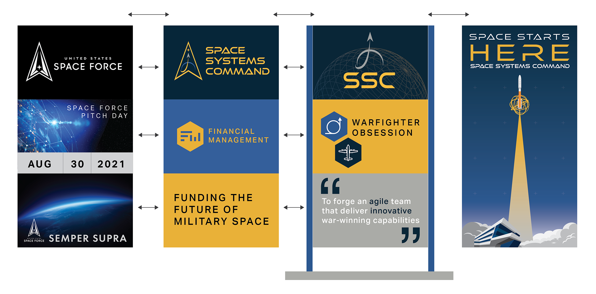
A visual identity design system built for an innovative and agile culture
In this concept for a physical or digital display product, it is designed for use in events, exhibits, recruiting campaigns, etc. This will require building a custom “device” that will have interchangeable and swappable, and reusable “cards” that can be reconfigured depending on the event. This could also potentially save money on costly printing and production. Who doesn’t like saving tax-payer dollars right? Using standard design elements such as colors, logos, type, graphics, symbols, etc. ensures the product stylistically is uniquely SSC. Using a grid system, provides potential for over a hundred combinations.
The SSC Design Gallery


