
Packaging & Identity Design (Concept)
I'moo by Horizon Organic
Overview
Horizon Organic is an American company founded in 1991 that produces organic milk and other organic food products. The brand is owned and operated by Danone North America. Horizon Organic is the largest supplier of organic milk in North America sold in supermarkets and grocery stores. They source their products from many family-owned organic farms across the United States from California to New York.
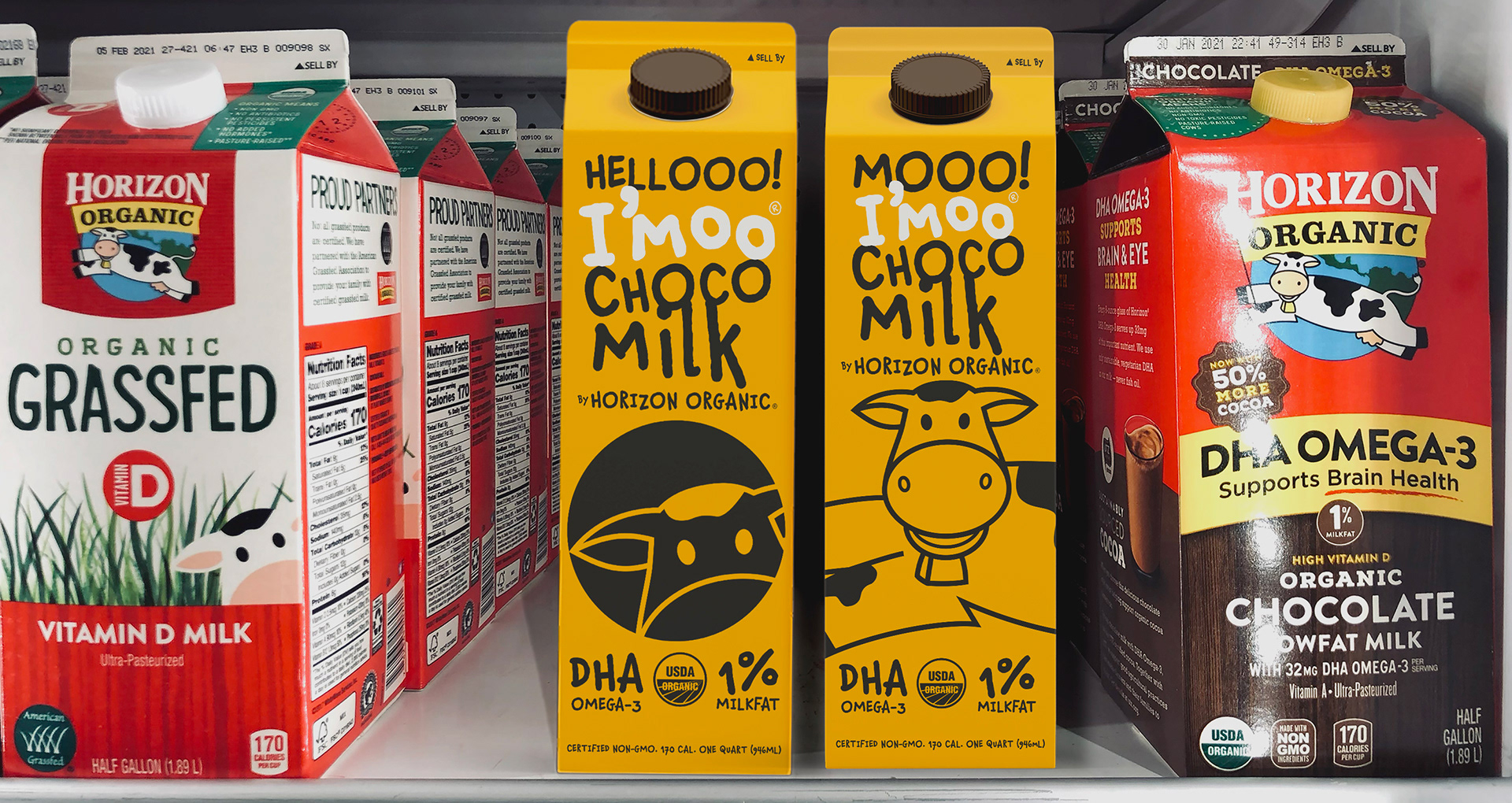
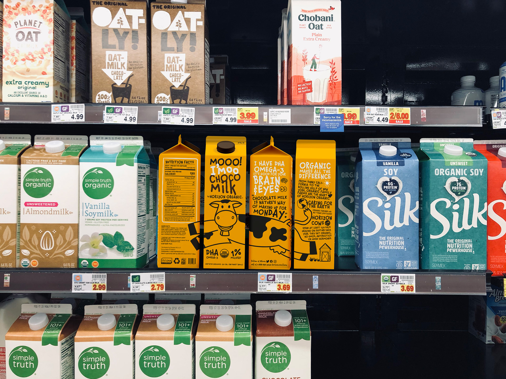
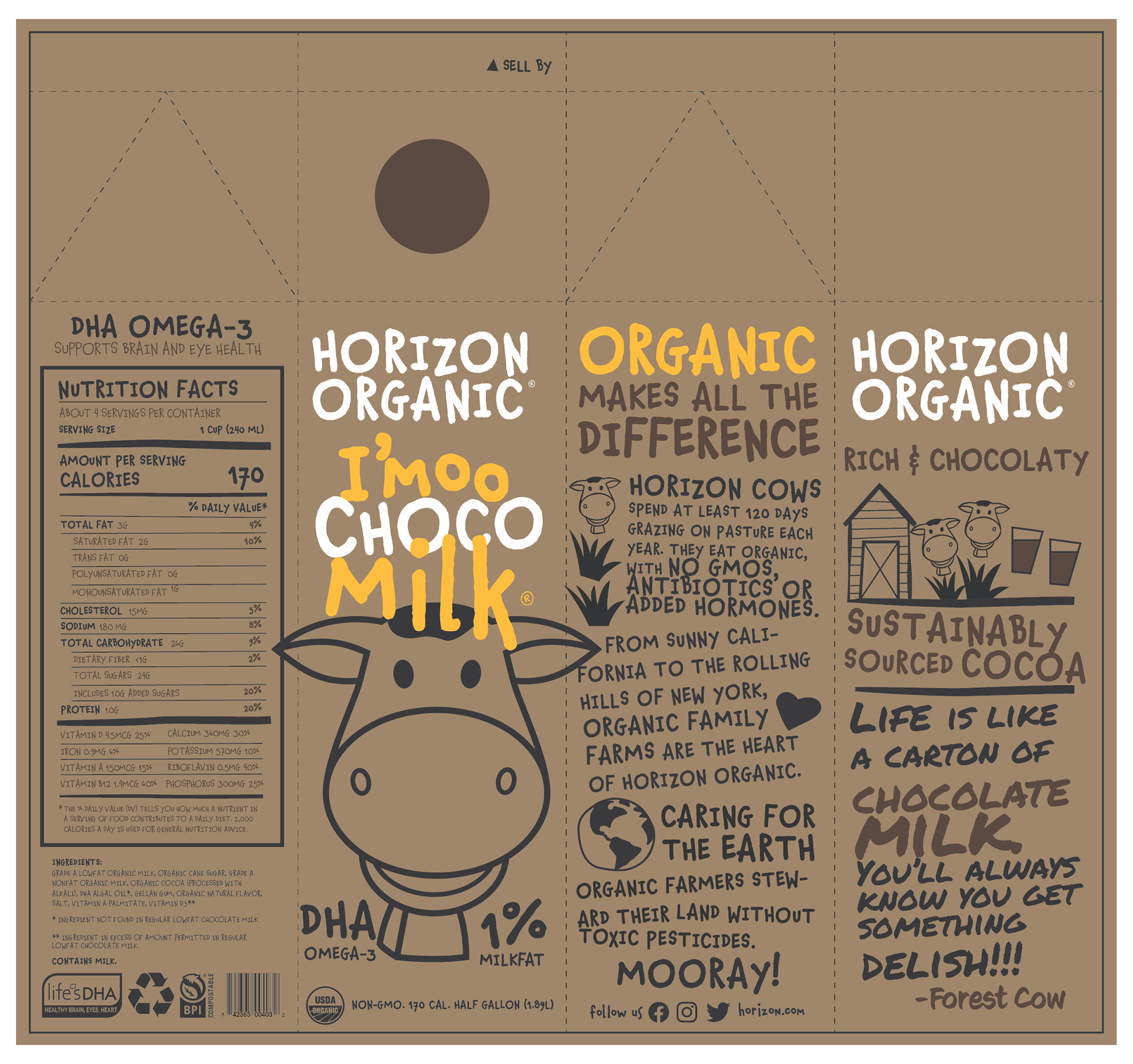
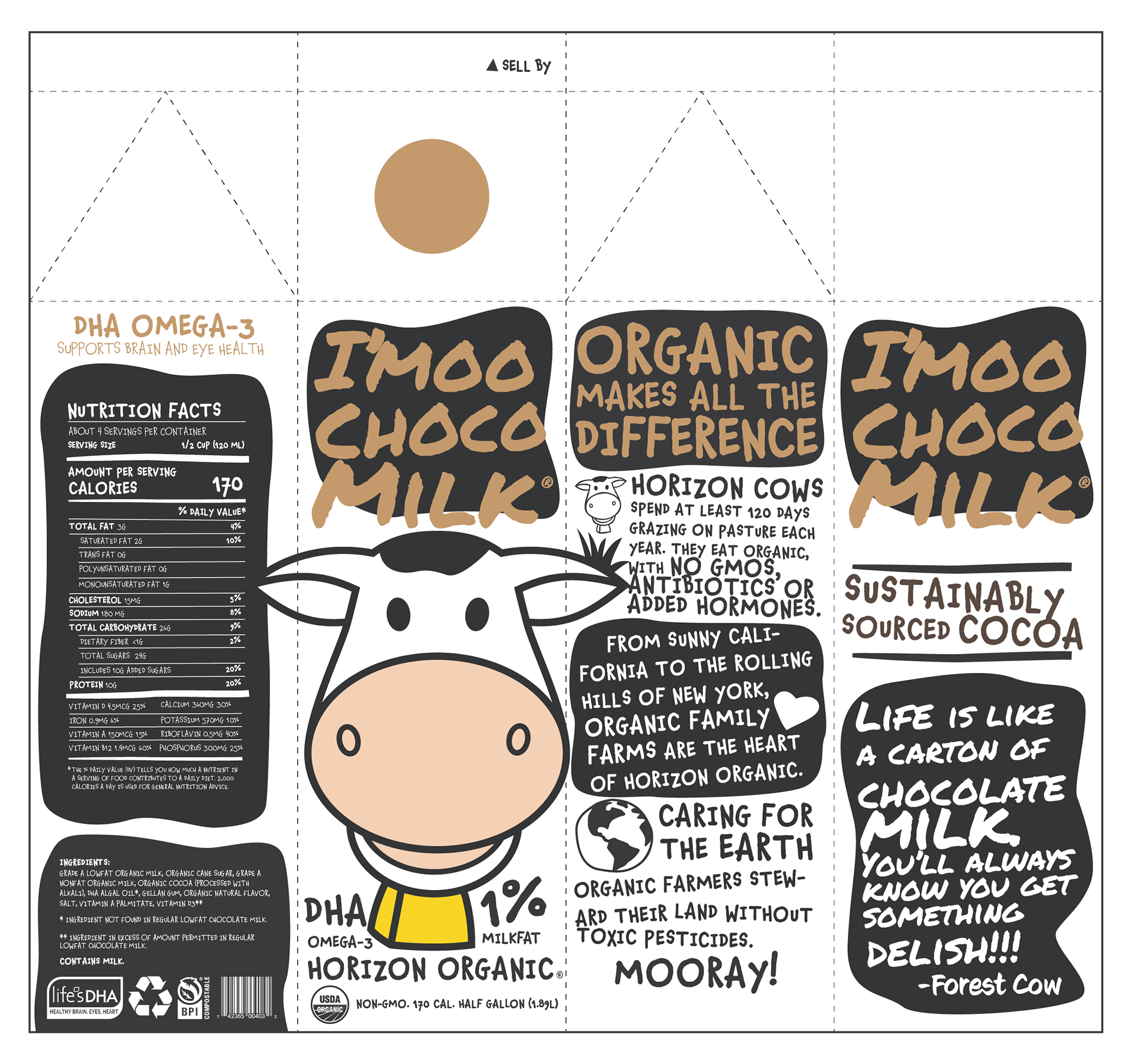
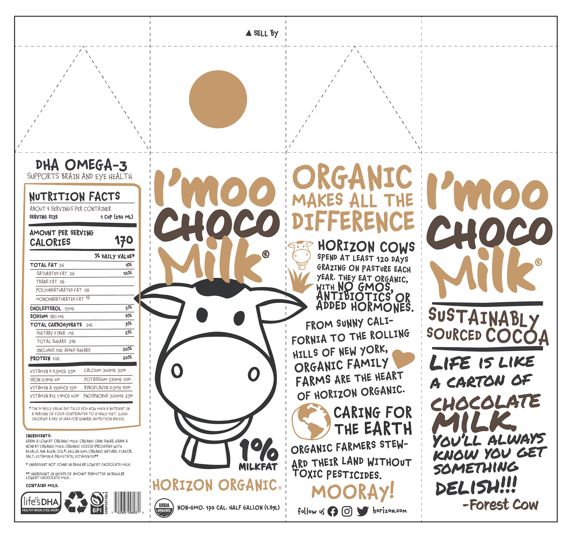
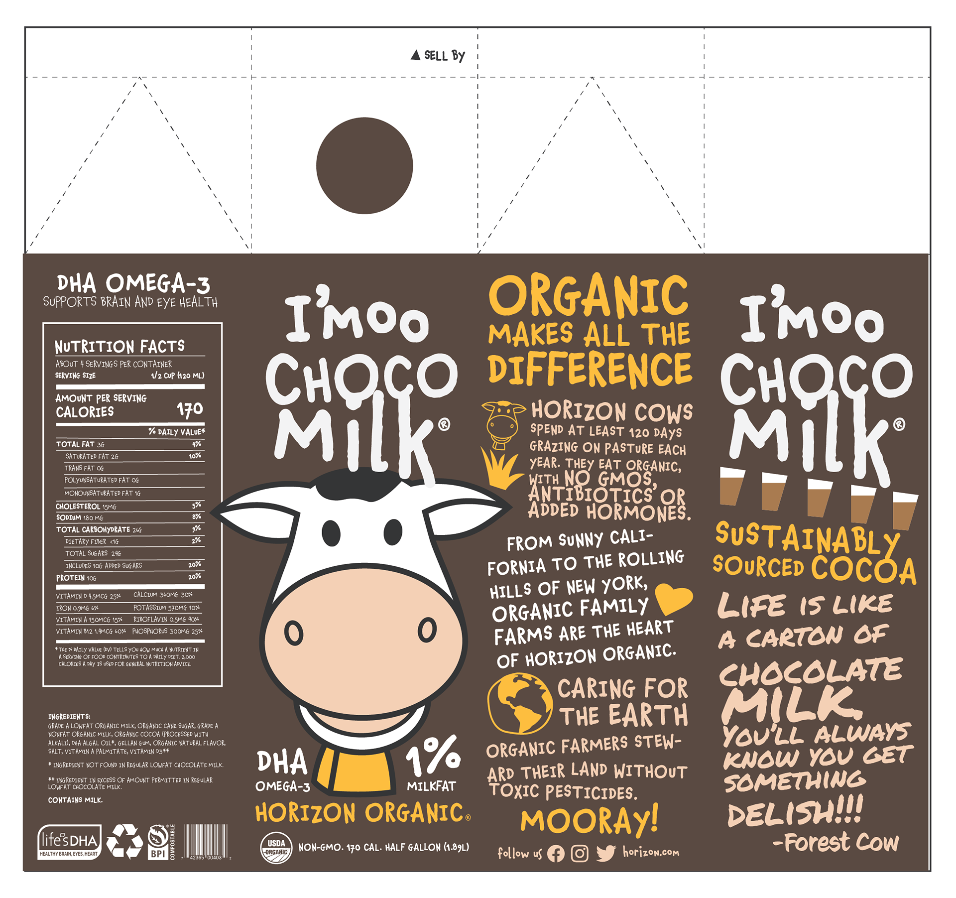
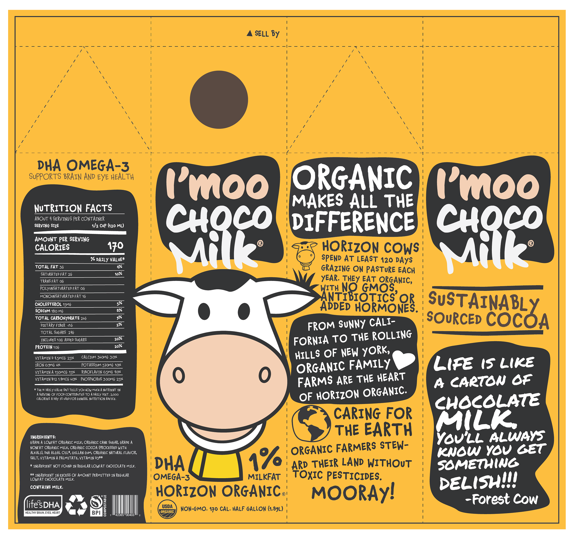
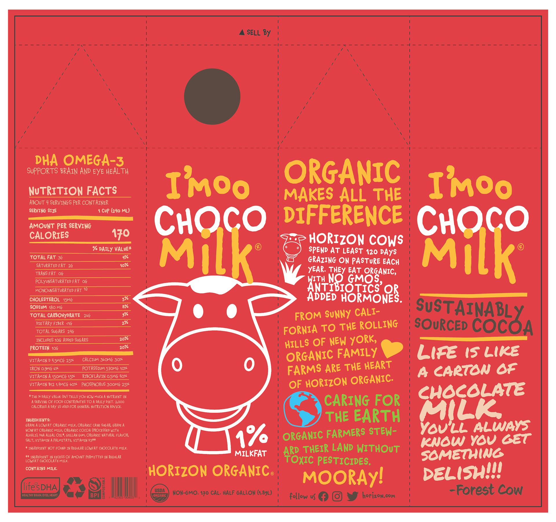
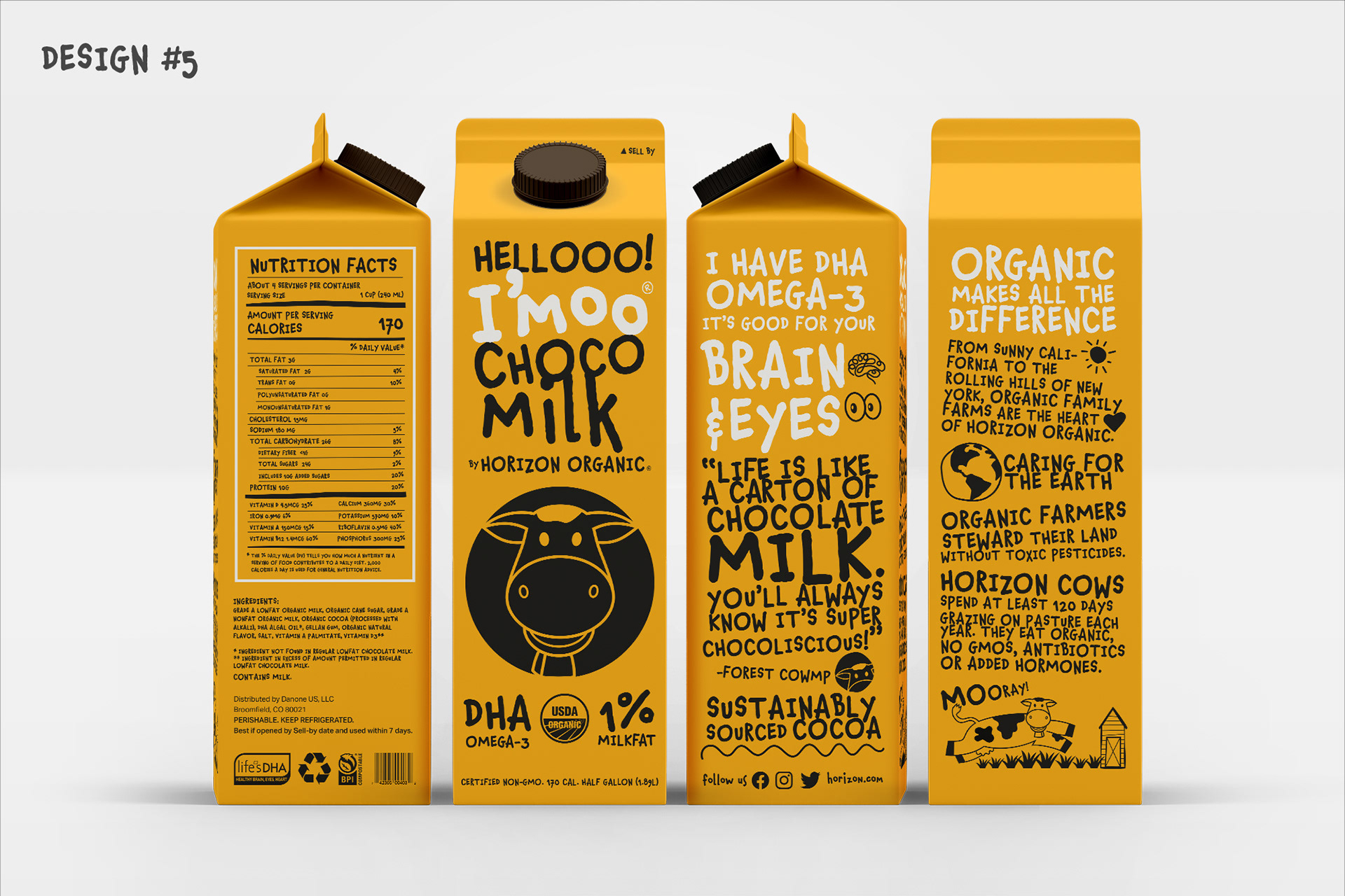
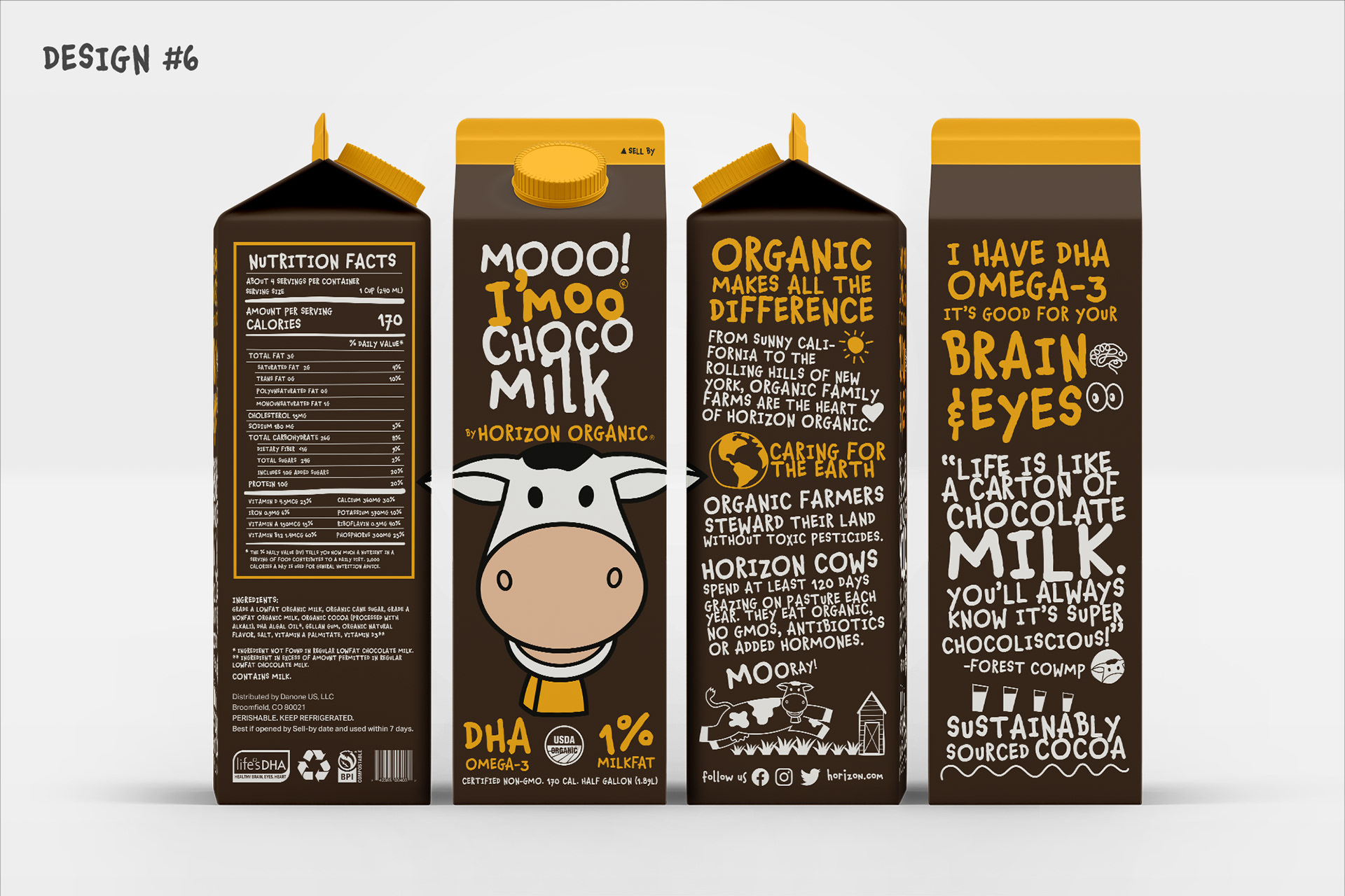
Horizon Organic’s brand design is well-established with its red with shades of yellow and white, and the leaping cow becoming a staple in many grocery stores. The company is exploring new packaging design beginning with their half liter chocolate milk package.
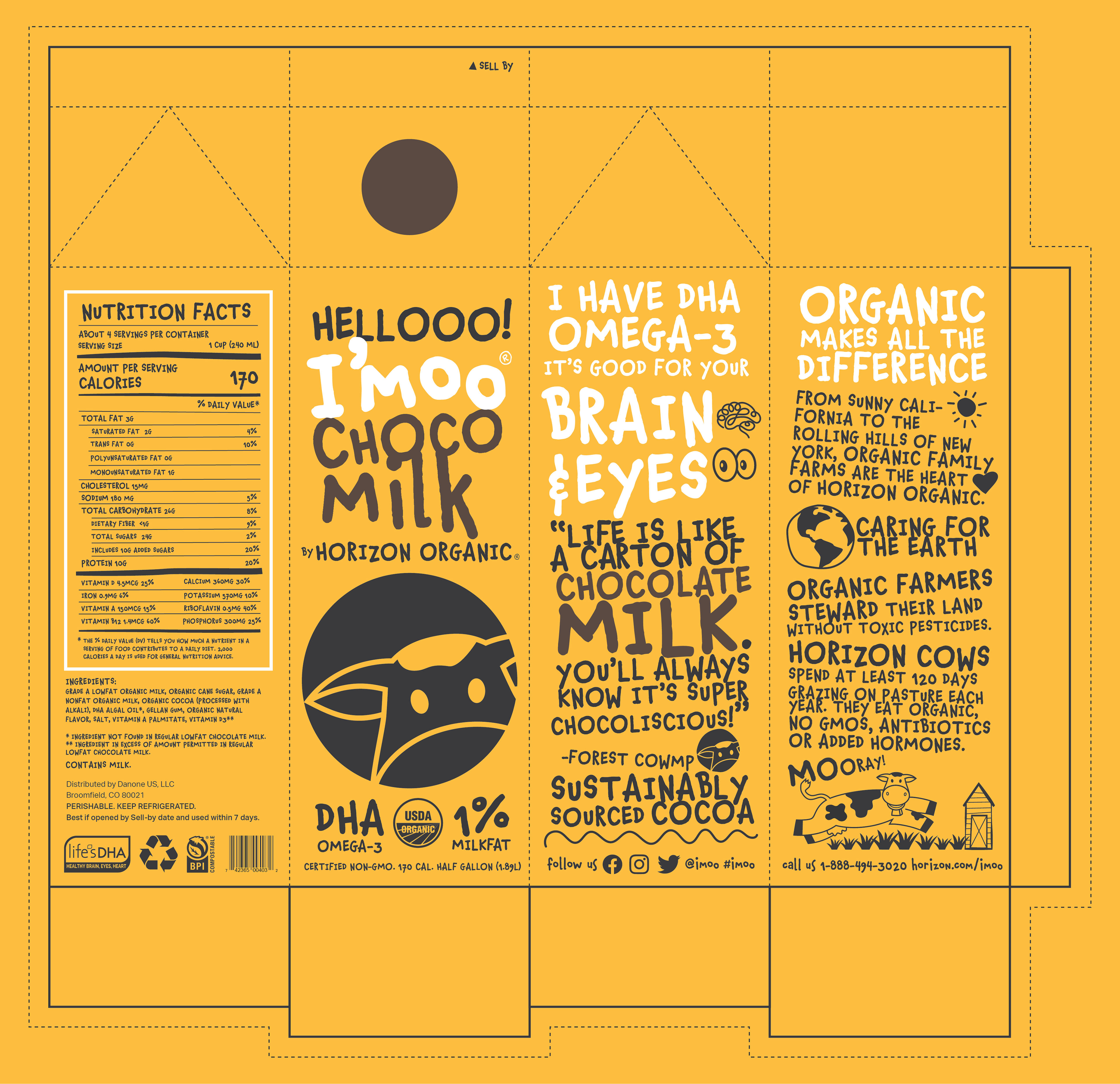
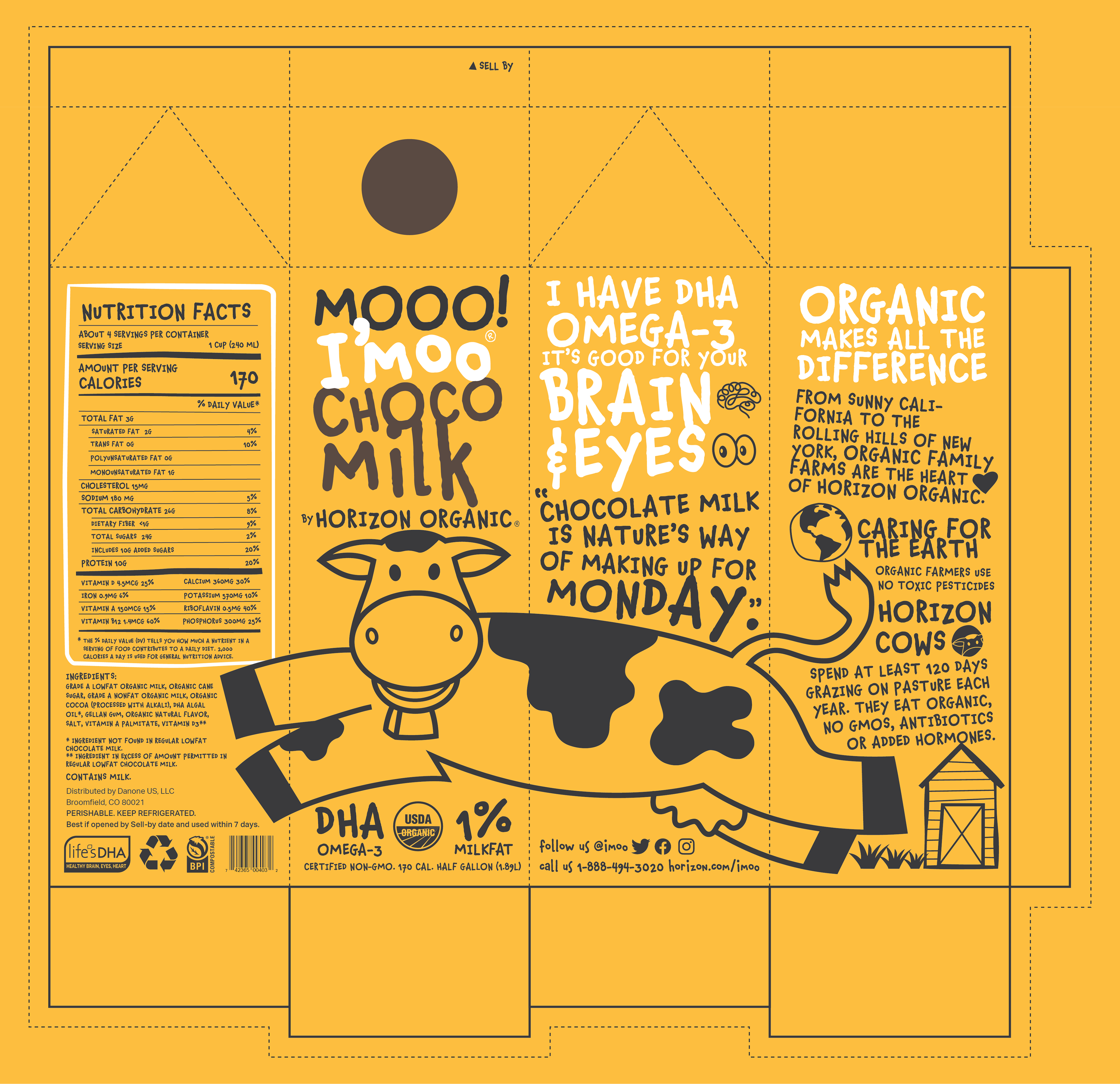
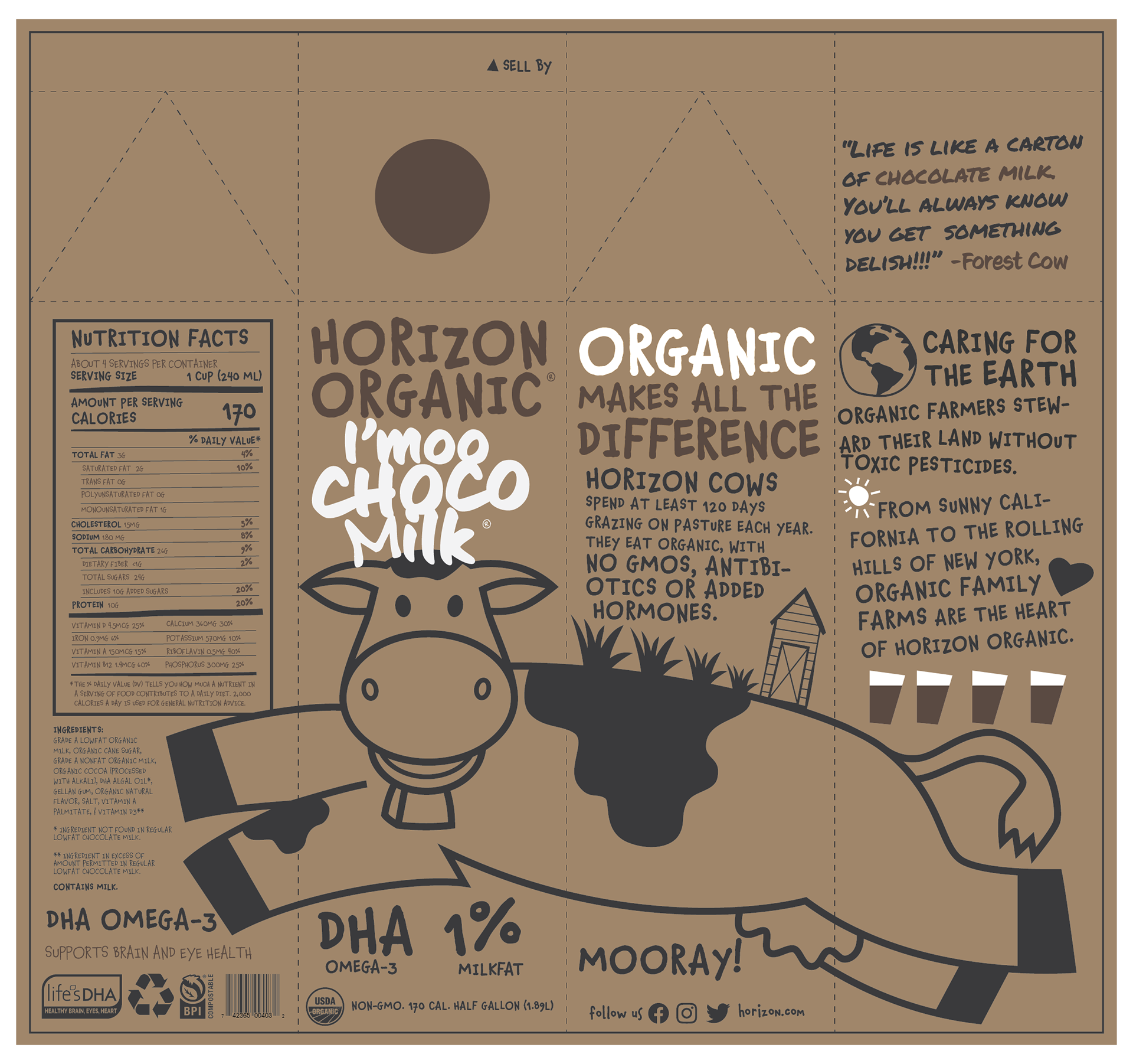
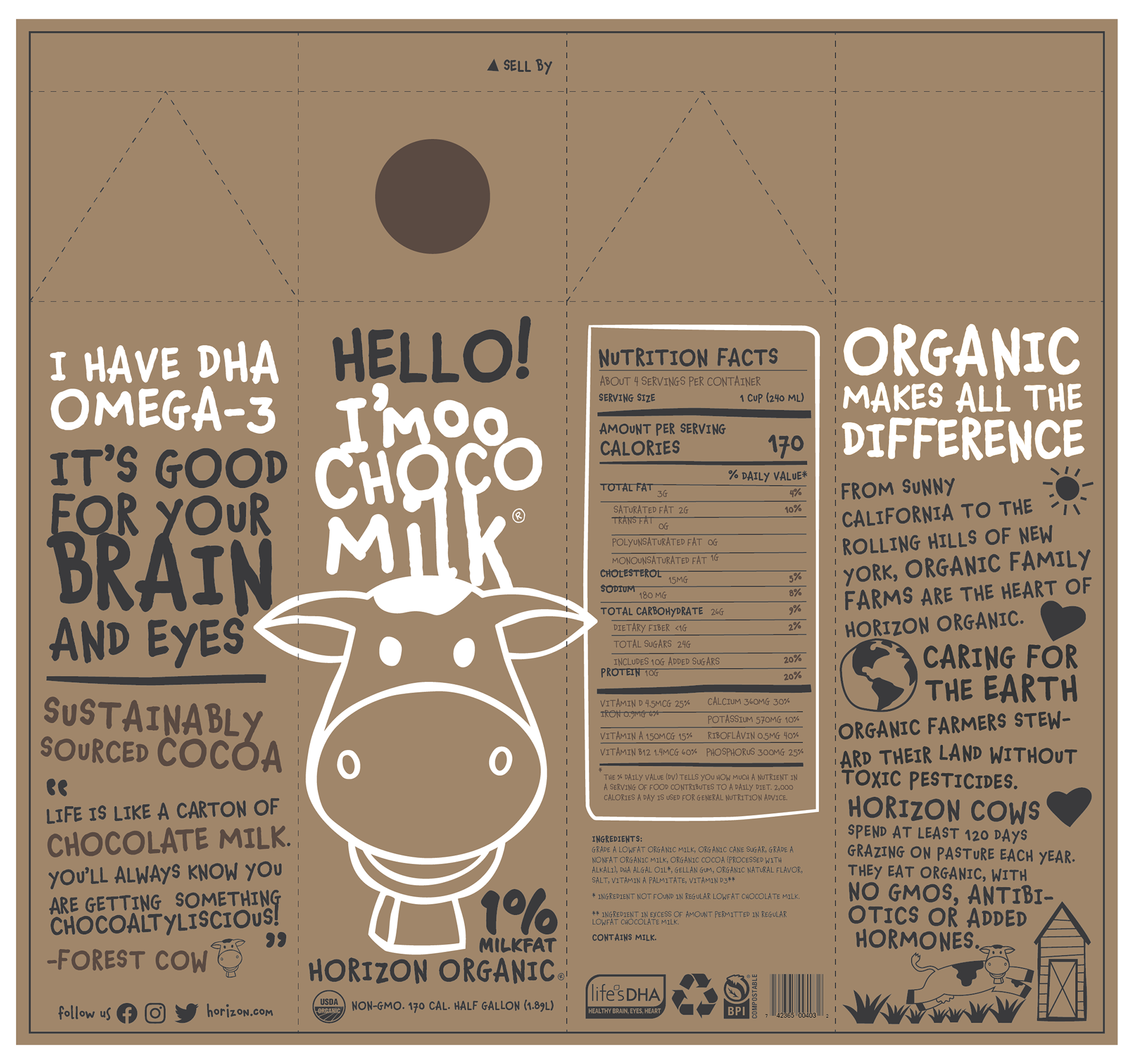
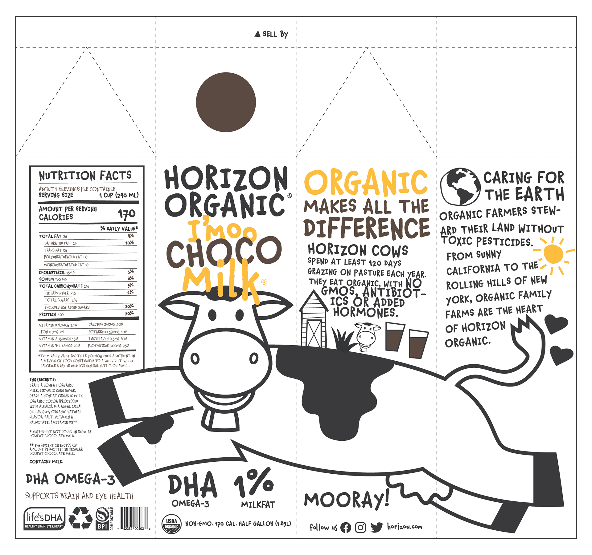
The design calls for a completely different visual approach to their established brand. With a brand new design, Horizon Organic is creating a new spin-off product line called “I’moo,” beginning with their chocolate milk product and potentially expand to other flavored dairy and fruits. The design is fun, whimsical, zany, and eco-friendly using a biodegradable and fully compostable packaging; using recycled materials and minimal colors for print to help reduce environmental impact of the new packaging design.
The New Brand: I'MOO by HORIZON ORGANIC
I’moo by Horizon Organic is a CONCEPT brand from Danone North America under the Horizon Organic umbrella. The new brand focuses on flavored dairy products beginning with it’s chocolate milk line and expanding overtime to include other fruit flavored products while maintaining the same healthy attributes that have made Horizon Organic stood out in the marketplace.
I’moo takes it to the next step by delivering a different kind of dairy brand filled with a fun and friendly personality. It’s attributes are fun, whimsical, zany, chatty, and friendly. The playful new logo (wordmark and symbol/icon) represents the attributes and values of the brand. The warm yellow gold color represents the energy and fun that the brand brings.
Design Tone + Personality
Fun
Whimsical
chatty
friendly
LOGO: The Face of I'moo

Wordmark
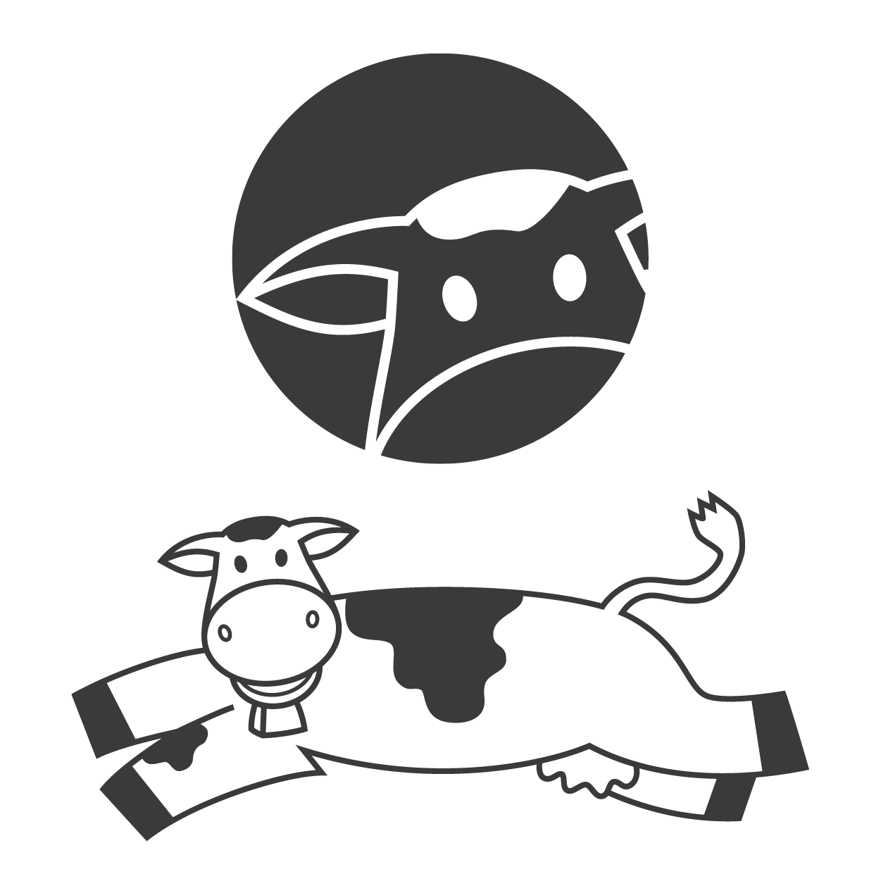
Symbol/Icon
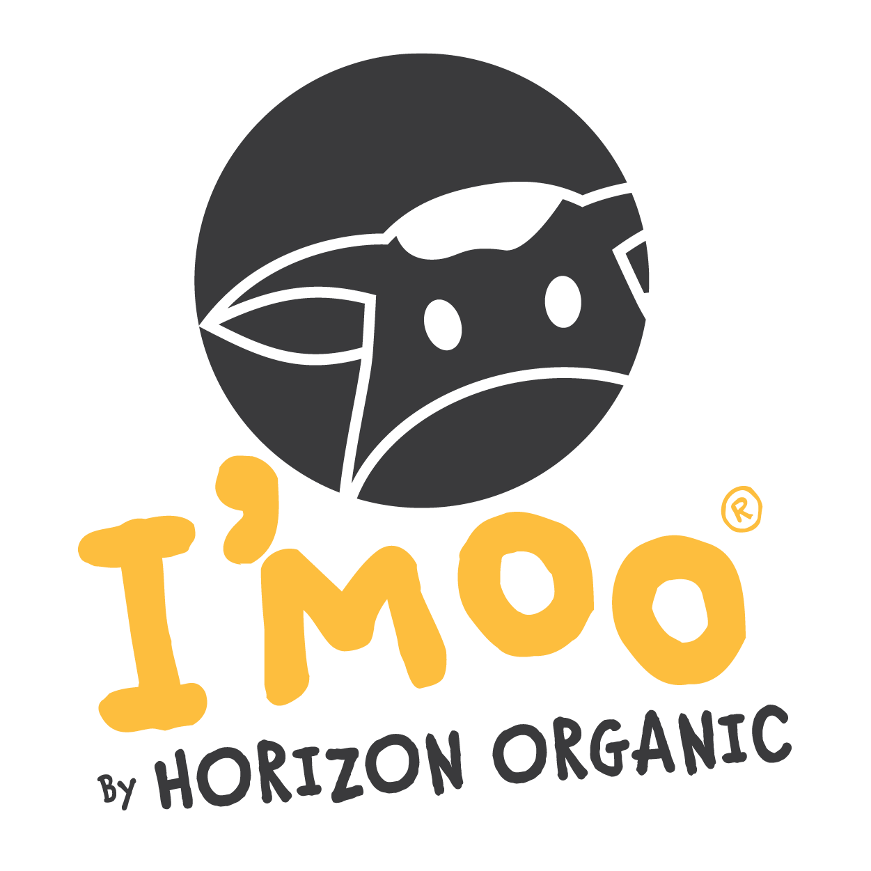
Full Circle Logo
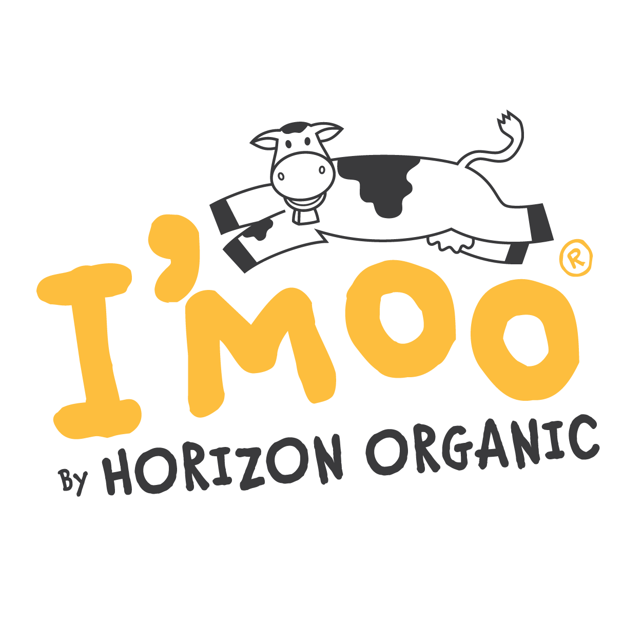
Jumping Moo Loo
The Colors of I'moo

The Typography of I'moo
Chauncy pro
Helvetica Neue
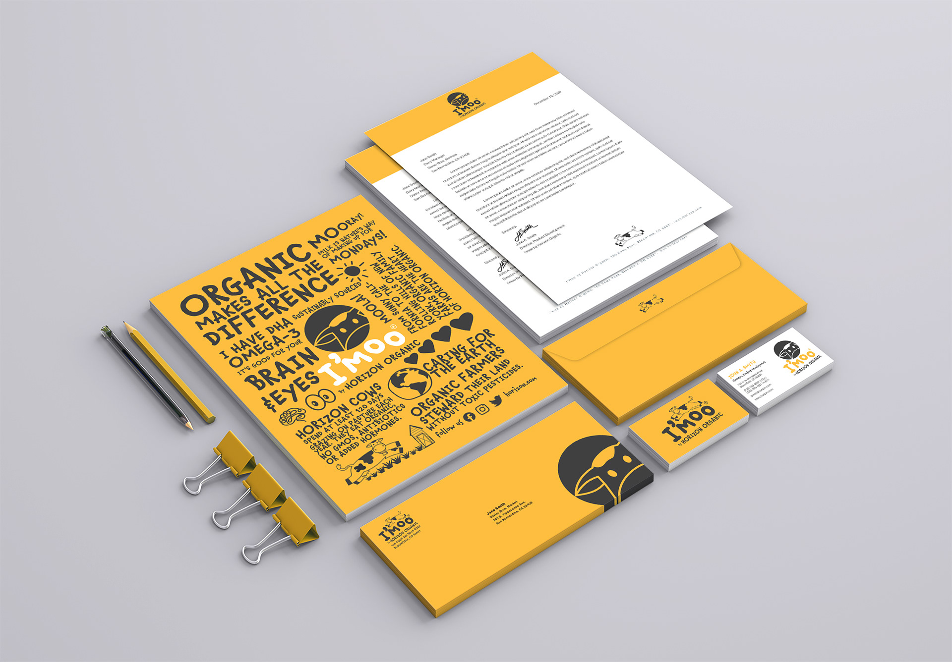
I'moo by Horizon Organic Stationery Set Design
packaging design
The Design Concepts
Design Development & progression
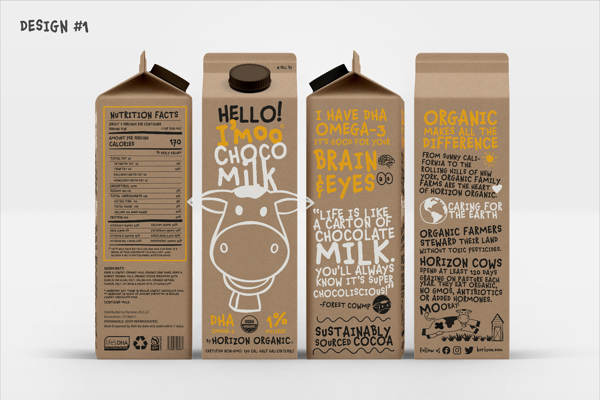
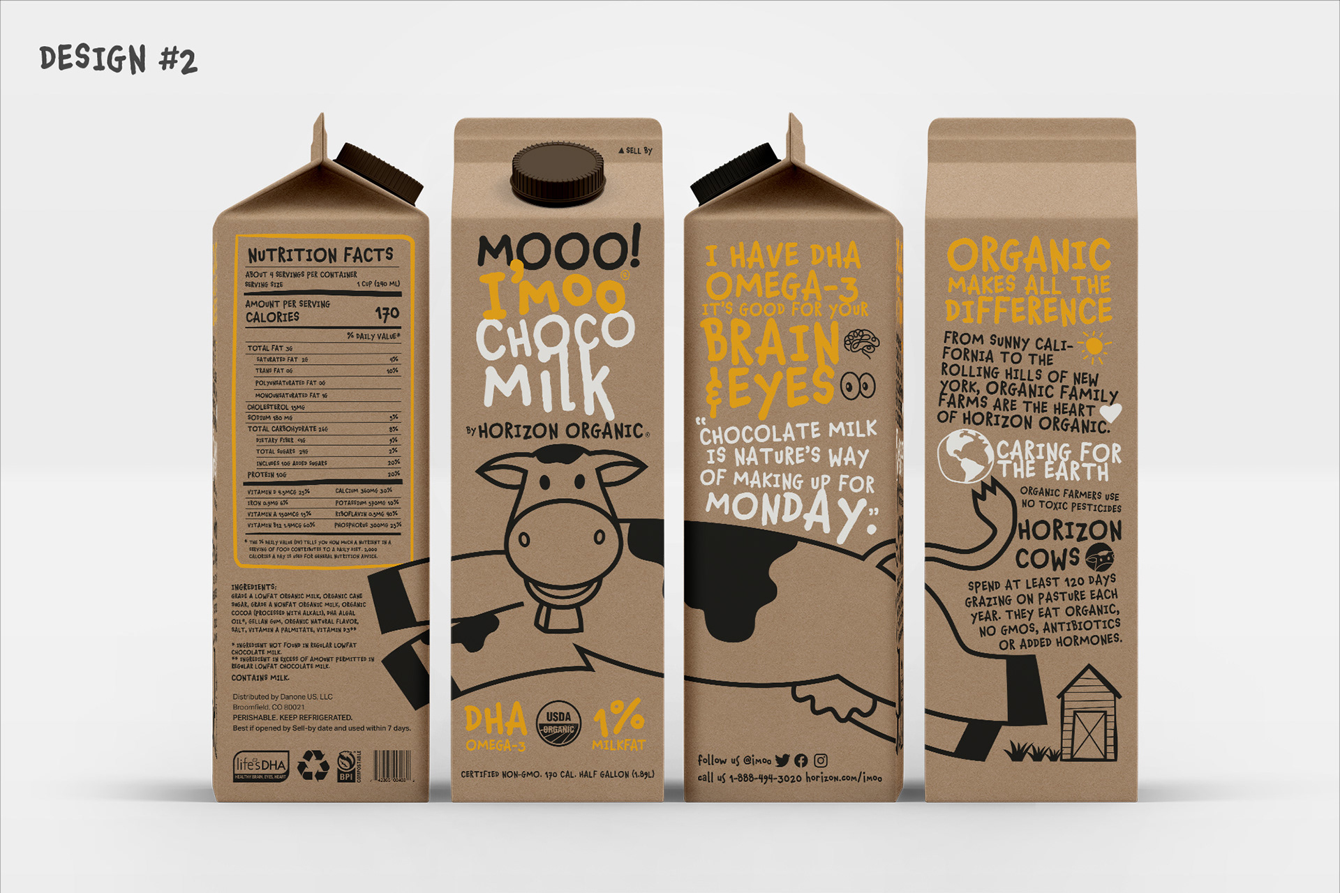
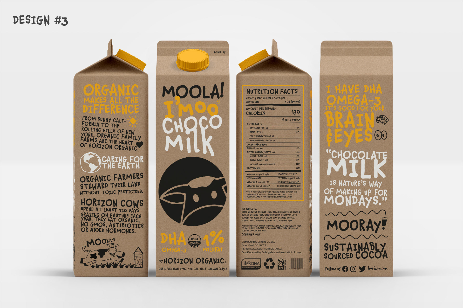

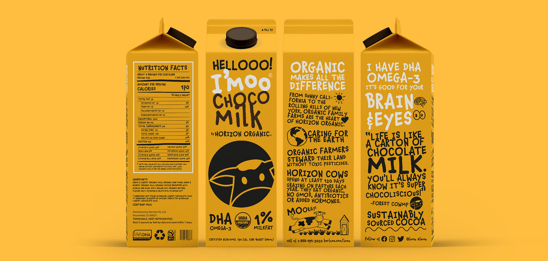
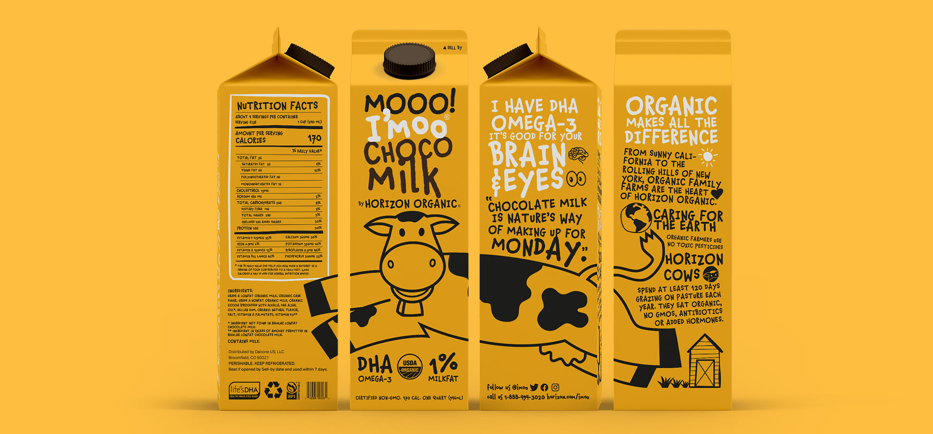
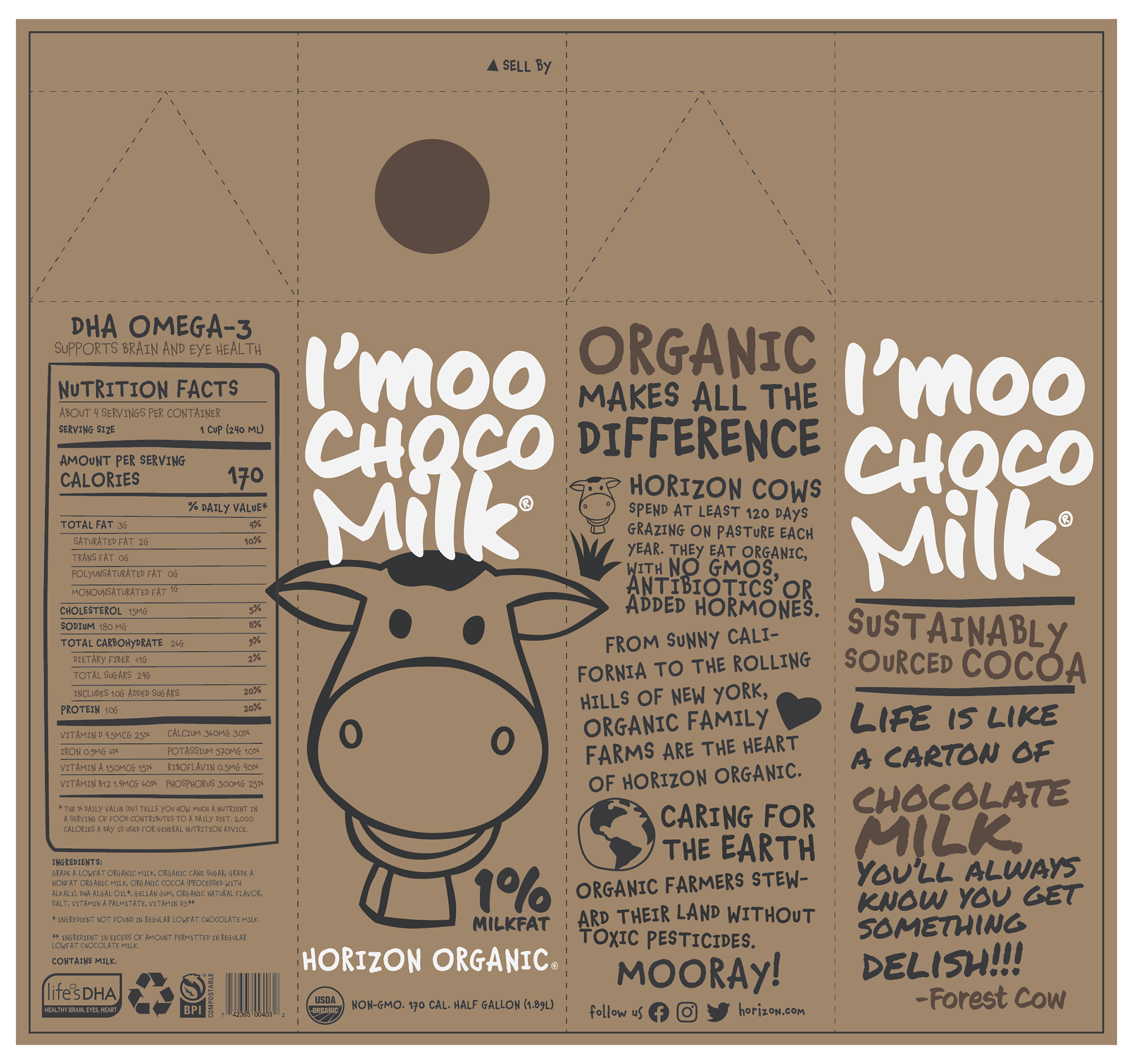
The Final Packaging Design
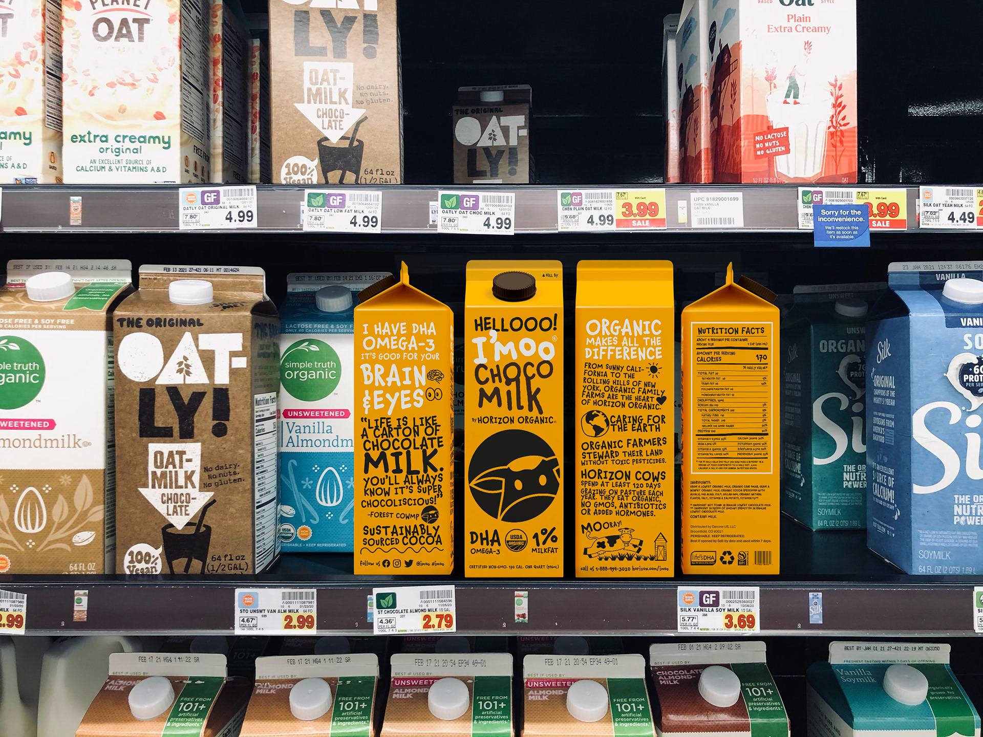
I’moo by Horizon Organic’s new packaging design reflects on its fun and whimsical brand attribute. The golden yellow packaging is intended to be bright and attention grabbing that catches a shoppers eyes right away from all the dairy choices stacked on the refrigerator shelves. The front of the packaging is simple and minimal. It screams hello with the larger I’moo logotype and icon. With a cleaner look of the front of the packaging, it balances the large graphic and type and its content that allows the design to standout from a sea of competitors. The other sides of the packaging reveals the brand’s whimsical and chatty personality displaying facts and quotes using a playful typeface and simple illustrations. The there will be different related funny quotes from box to box to create a fun variety. The combination of the playful typography and color palette also creates a flexible and versatile brand that allows for expansion into other product line.